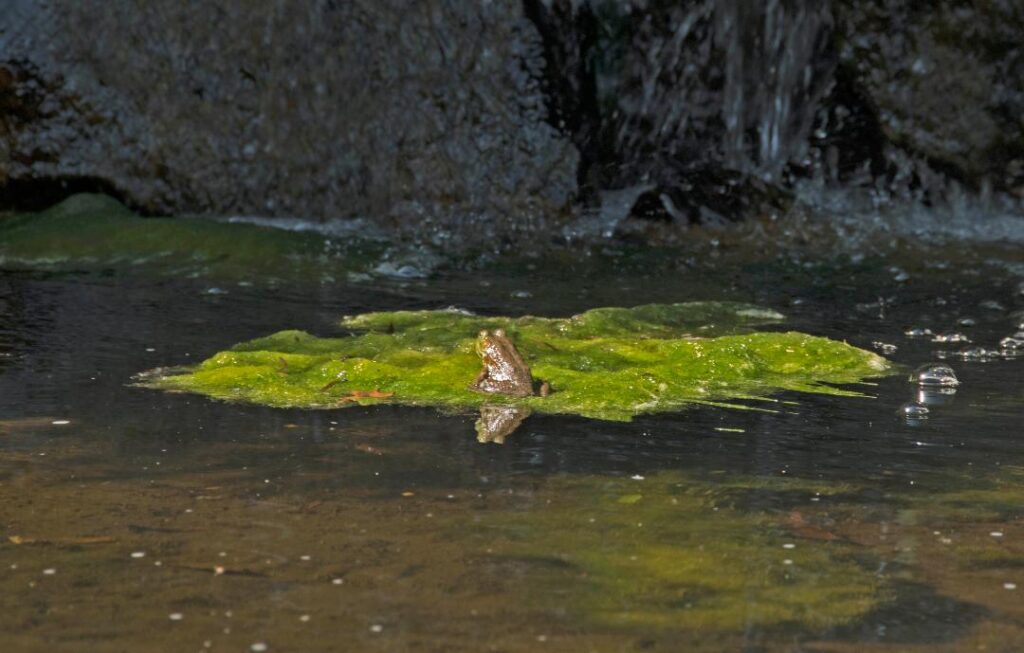
Life is what you make of it.
For some, it’s pond scum.
For others, it’s an island on which to bask in the sun.
I have a maxim: Always have time to pick the wine berries. It originates from the fact that if wine berries are ready to be picked it is best to do so now. Waiting until the next day will not do, as the birds will have taken care of the job by then. Plan you day with time for a spontaneous act or two. And do not allow boundaries to get in the way.
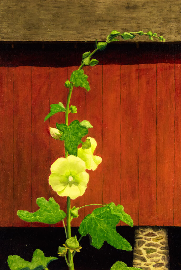
There are options on how to shop for food, just as there are on how to create a painting. When shopping A) One can just go grocery shopping and buy what strikes one’s interest once there. B) One can write a shopping list before going shopping, and then zoom all over the store looking for those items. C) One can write the list according to the layout of the store and pick up the listed items in an orderly fashion. D) One can make the list knowing the store layout, and still deviate from the list as inspiration strikes.
In painting, as in grocery shopping, planning and inspiration combined can produce the most interesting results.
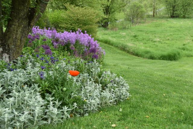
A solitary bit of red. This reminds me of the rivalry between John Constable and J.M.W. Turner in the early 1800’s. The rivalry broke into very public view at the Summer Exposition of the Royal Academy in 1832. Their entries to the show were hung next to each other (in this post, Constable’s Opening of the Waterloo Bridge is above Turner’s Helvoetsluys), setting up a direct comparison in style and technique. At the last minute (on Varnishing Day, when artists are allowed to make adjustments to their already hung work), Turner took it one step further; he added the red buoy to his seascape, thus overwhelming all the red on Constable’s canvas.

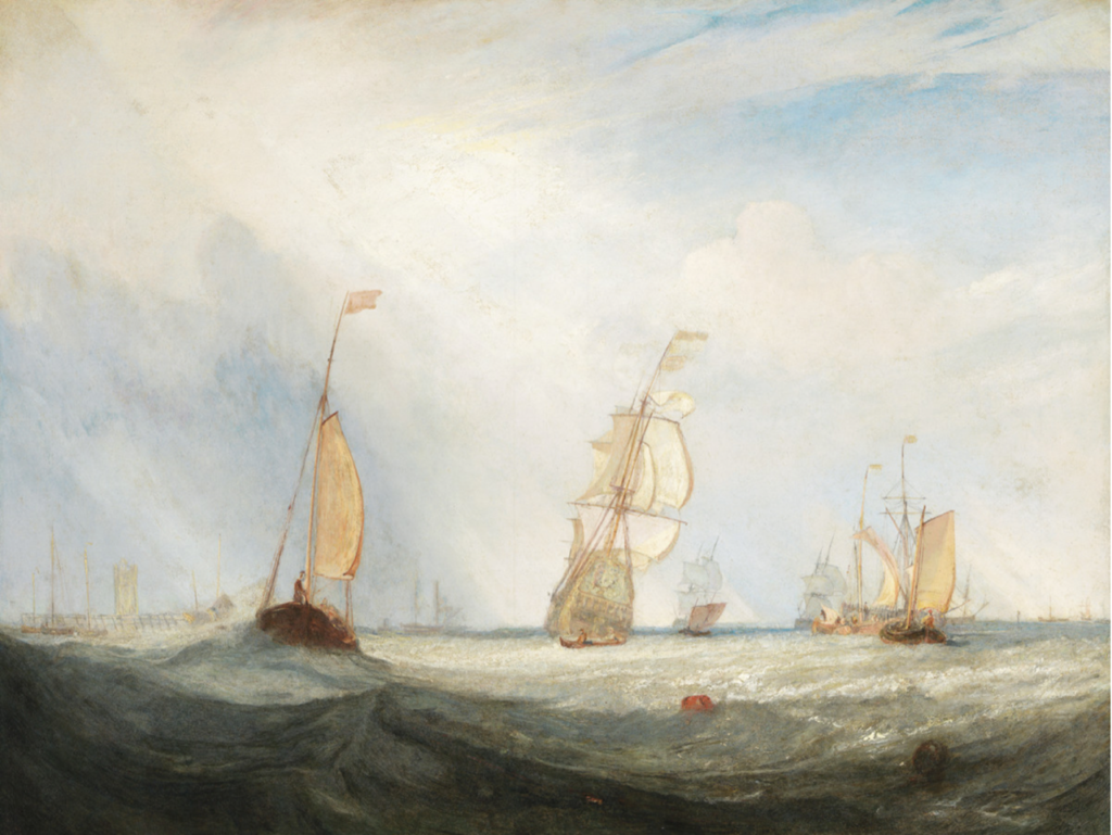
I have always though the single red buoy greatly improved Turner’s painting, even if it was done to needle Constable.
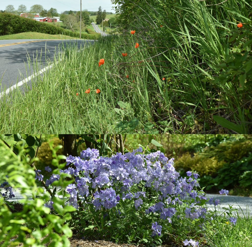
One never knows when or where a plant combination idea will strike. Sunday, while out on my bike, I noticed some of the verges were occasionally peppered with the red poppy Papaver rhoeas – just a sprinkling here and there, nothing in your face or over the top. It struck me that their red would be a great foil to Phlox divaricata ‘Blue Moon’, also blooming now. The question about that grouping is: since the poppy basks in the sun, while the phlox dallies in the shade, could they be coaxed into co-habitating somewhere?
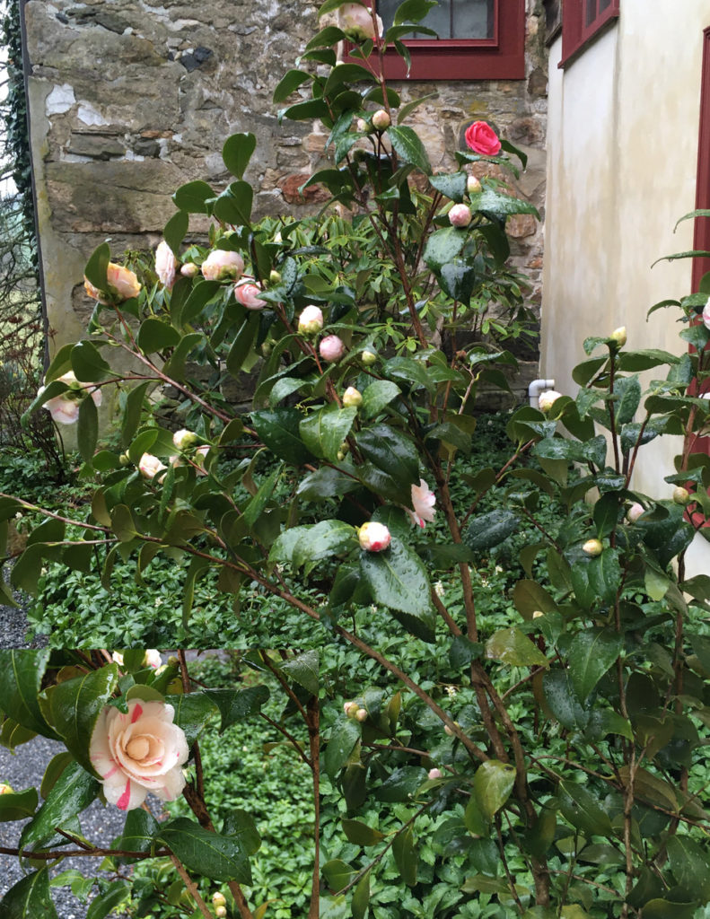
Camellia japonica
We teeter on the edge of how far north Camellia japonica can be a successful indulgence. The best possible location we have for growing camellias is in the micro-environment of our walled-in Japanese garden. Nature, however, was not so sure. For a number of years we battled back, nurturing the camellia along, pruning out the winter kill, hoping for a better result next year. Then this spring – zap! I turned the corner in the garden one day and there it was – in full bloom. The camellia seemed to think it had been sojourning in Georgia or at least North Carolina for all its boastfulness. My thought was, nice try, but I am sure the mild winter deserves the credit. It is similar to the color in a painting trying to claim the glory, whereas tonal value is really doing the heavy lifting.
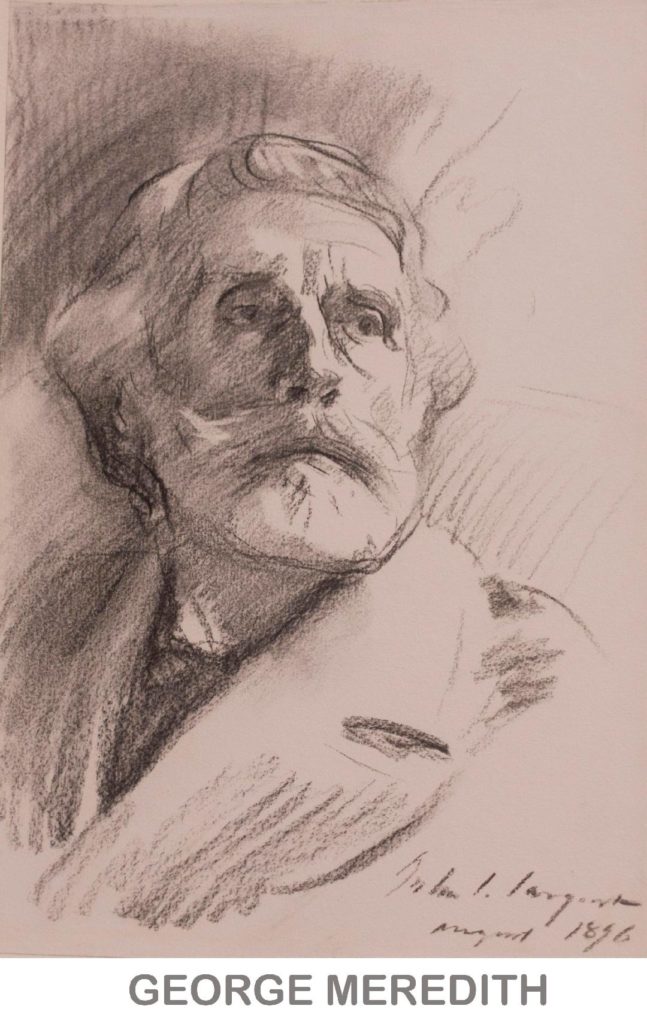 Last winter The Morgan Library offered an opportunity to see the results of a master craftsman at work. It was remarkable to be able to see everything – from Sargent with all his flourishes at his grandiose best, to Sargent the insightful portraitist, to Sargent the hack just doing the job he’s been paid to do. All of these versions of Sargent’s charcoal drawings were spread across several galleries.
The drawing of George Meredith was the most instructive of the drawings, where it was easiest to see how Sargent worked. Everything Sargent did is still clearly visible – he mostly stuck with the lines and tones which he originally laid down, not obscuring them with further work. It’s similar to the old exercise of doing a painting with seven strokes of the brush. The artist must pre-plan (thought of as the artist’s style), using intuitive choices along the way.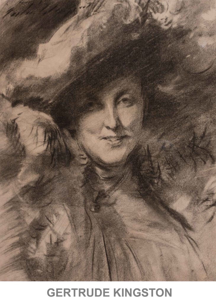
The portrait of Gertrude Kingston was Sargent at his most flamboyant. Mentally, one could see this charcoal drawing as a portrait in oil. One could feel that famous, unhesitating, sweeping Sargent stroke of the brush. Indeed, it’s more luxurious to see that stroke in a drawing, than in an oil. When using oil paint as his medium, Sargent would survey his day’s work, and, if dissatisfied, he’d wipe it all off and start afresh the next day. Thus, in one of his paintings, that stroke we all admire could have been the result of a dozen or thirty attempts. In a charcoal drawing, no such complete wipeout is possible. When a line/stroke is laid down it’s final.
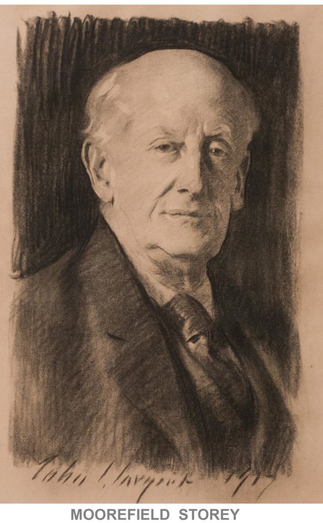
My favorite drawing was the one of Moorefield Storey. The drawing caught me unawares: the character that radiates from the drawing was as mesmerizing as the drawing itself. Storey was one of the original civil rights lawyers becoming ahead of the in NAACP in 1910.
Every artist has their share of work that misses the mark. I always study both the successful and the un-successful, since the latter teaches me about what doesn’t work, what not to do. However, I am going to leave all these Sargent’s drawings on the uptick.
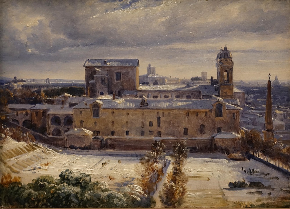
André Giroux’s Santa Trinità dei Monti in the Snow
Currently the National Gallery of Art in Washington, D.C. is hosting a very interesting show of plein air paintings. The show consists of 90 paintings by about 70 different artists, all painting between 1780 and 1870. I found this show particularly appealing because I could study some very good paintings, as well as directly compare different styles and techniques. As a bonus, I discovered two examples where different artists painted the same scene, though not at the same time.
Two almost universal techniques in this collection were the starting of the painting with a pencil drawing, something one sees more with watercolor, and a thin application of purple paint for distant mountains.
In contrast to the widespread difficulty many of the artists had with trees and clouds, one Constable cloud study demonstrates a successful technique for handling clouds. He used a fairly stiff brush with minimal paint, only loading up the brush enough to create a few highlights. This gives the clouds a soft-edged feeling.
Clouds are water vapor which is least dense along the cloud edge, where there is a temperature boundary and, thus, a condensation boundary. What we see as a cloud is the reflection of light off the water droplets. I recognized that a similar technique which was applied to trees, or more specifically their foliage, was also successful, but for a different reason. Leaves themselves have a hard edge, but as a mass there is no continuous line at their edge. Instead, foliage edge is a series of short little lines. The similarity of foliage with clouds is the variation of the density of the mass.
The three outstanding gems in the show were Constable’s cloud study, Augustus Egg’s courtyard painting – because of its handling of leaves – and André Giroux’s Santa Trinità dei Monti in the Snow. In the latter painting Giroux catches the light’s effect on the rooftop snow. He must’ve either been very lucky and have already started the painting before it snowed, or done a very good, quick study drawing, because the moment captured had to have been very fleeting. Either way, Santa Trinità dei Monti in the Snow is the best of these top three paintings.

Venice: San Giorgio Maggiore – Early Morning,” 1819
At the Mystic Seaport Museum are some 90 of Turner’s watercolors from the Tate in London. Chronologically, the paintings run from the mid 1790’s to the 1840’s. Given the chronological span of the show, it seemed a great opportunity to see how his style evolved over the years.
While I didn’t see what I expected, I found this a rare chance to study Turner’s technique. The show starts in the mid 1790’s with very realistic watercolors which would be instantly recognizable as British, from the late 1700’s. Turner soon evolved into a looser style, painting mostly landscapes or seascapes. Once he hit his stride, he really didn’t change very much. In fact there two paintings 30 years apart which are virtually identical, except for their size. Throughout, he used only three colors – blue, red, yellow – and did not mix them, relying on tonality for strength.
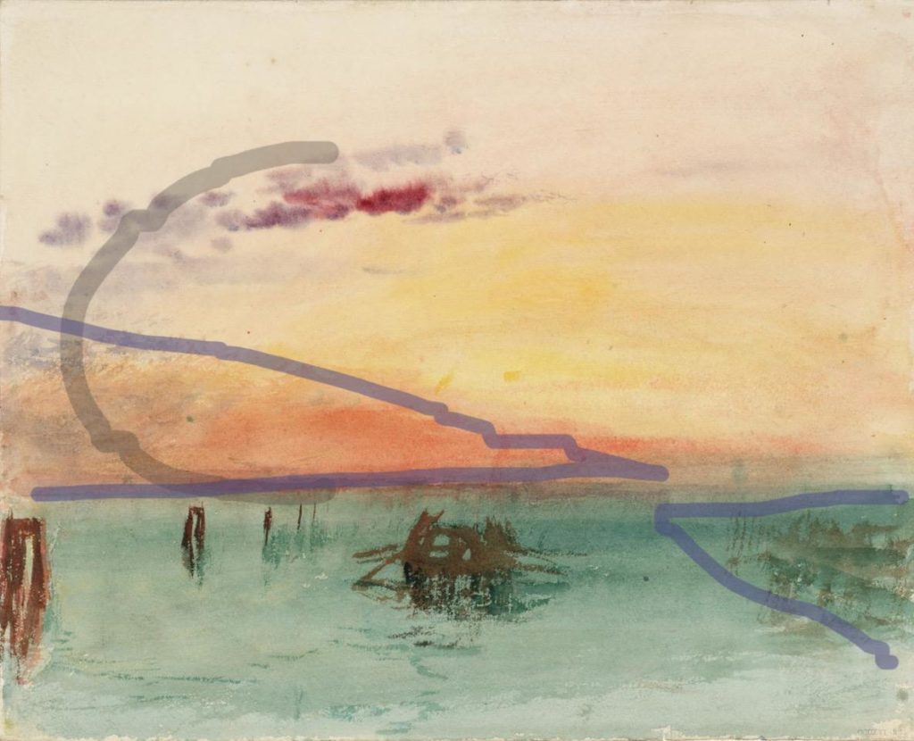
Compositionally, he stuck with a limited number of formulas. Landscapes were mostly composed of tonal wedges used to create a sense of depth. A sprinkling of vertical masses, as in canyons or alleys, appeared occasionally. A sweeping half circle reminiscent of the letter C or its mirror image was used compositionally in both land and seascapes. *(See below.) Seascapes also made use of a horizontal composition. Whatever the composition, tonality was always a touch stone.
I should mention here an under-appreciated aspect of Turner – he derived a steady income as an illustrator. Only a few of his watercolor illustrations made the show. They have a strong connection compositionally and tonally with the larger paintings in the show. The difference in the illustrations is their size (book sized) and having some real, linear detail worked in. I was left wondering whether his work as an illustrator gave him such a commanding sense of tonality. Remember the adage – color gets the credit but tone does that work. Engraved illustrations were printed with the same black ink as the type in the book, so tonality was of the utmost importance.
Although I did not find the stylist progression I had expected, this extensive selection brought home both Turner’s mastery of tone and his limited, but strong use of color. The connection between the watercolors shown and the great canvases that spring to mind when we think of Turner is threefold – tonality, limited, but clear color, and thin washes of those colors.
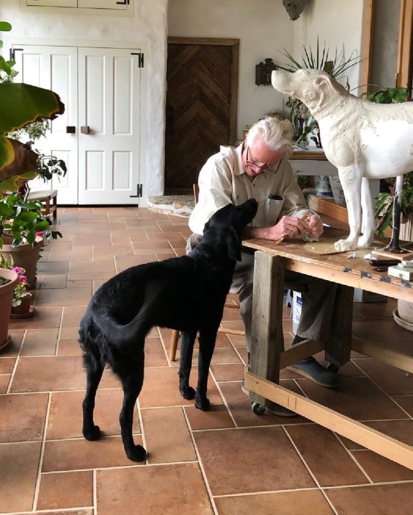
There is an expectancy in dogs who are left outside a shop that their owner will return imminently, and, hopefully, with a treat. No matter where we travel we see examples of these patient dogs, especially outside coffee shops. Our daughter’s dog may look like a Labrador, but she is really a mix breed who came from the streets of Suesca, Columbia.
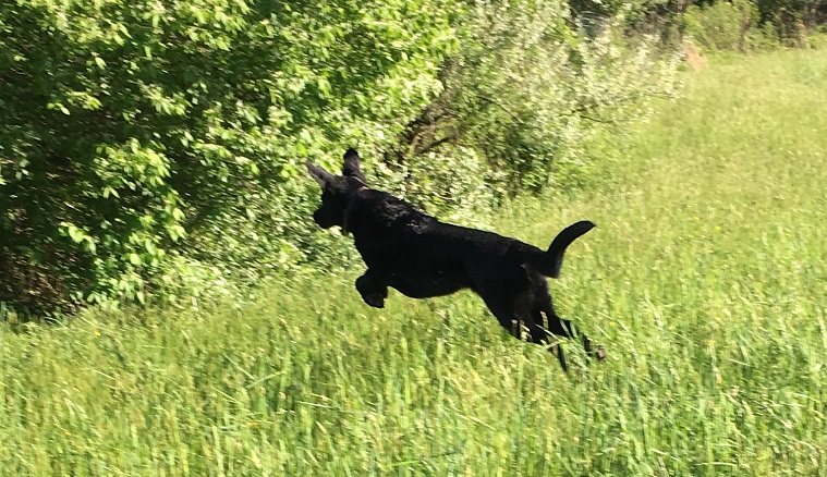
She is lithe, fast in her lope and good-natured, though like all the models in the Bright family, she becomes a little recalcitrant about posing after a while.
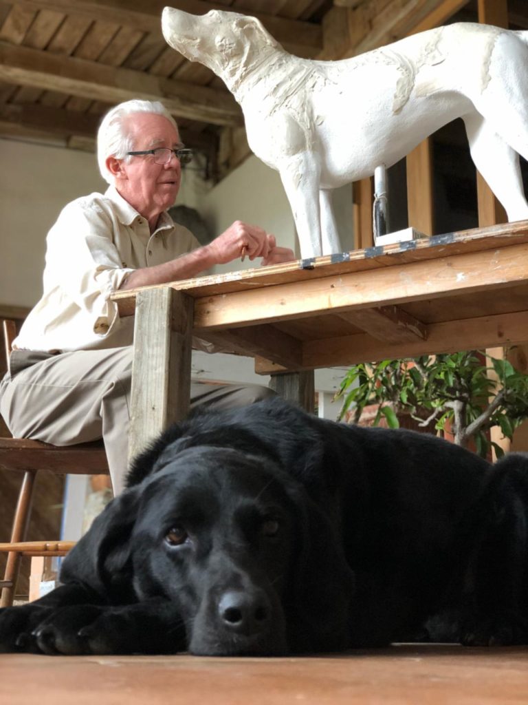
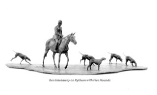
A comment on a recent Facebook post reminded Clayton about the sculpture he did of Ben Hardaway. Happy Thought was Ben’s favorite horse at the time, however, Ben thought that he looked a little big for her. Instead, Ben chose to be on Rhythm for the sculpture Clayton did with five of his favorite hounds.
While Clayton was working on the hound part of the sculpture he had a conversation with Ben about hounds’ feet. Clayton commented on my preference for a hound with a foot more like that of a fox or greyhound. He felt their longer foot seemed better suited to loping and running, than the more cat-footed hound preferred by so many huntsmen. Ben, who must have had north of 60 couples at the time, pulled from the kennel a hound which was very nondescript in every way except its feet. He declared the hound had the best feet in the pack. A fox or a greyhound would have been proud.

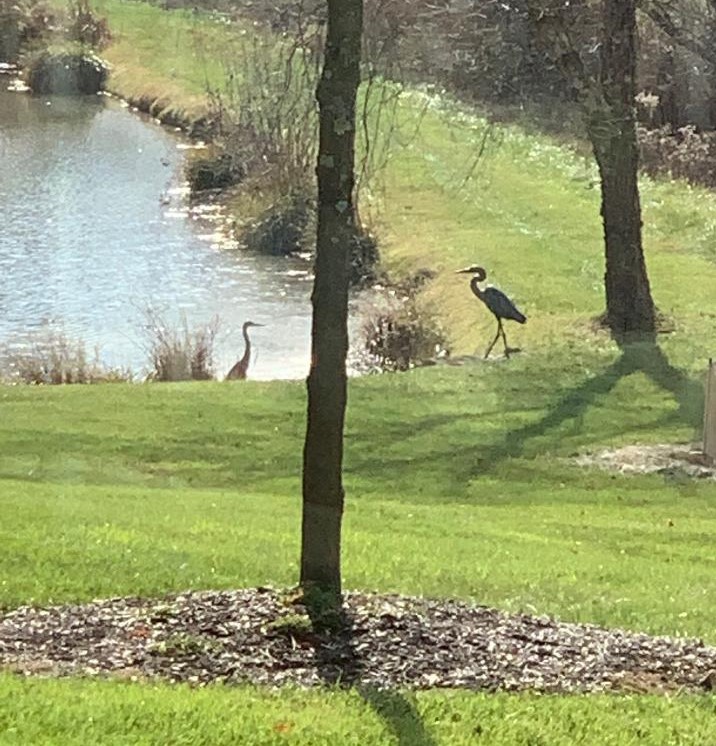
Clayton installed his bronze sculpture, Great Blue, in October. Within two weeks the family spotted another heron nearby. The live heron seems to like its new friend – no threat – just another presence at the pond.
We are intrigued by how live animals of the same species respond to Clayton’s sculptures. Dogs sniffing the rear ends of A Couple of Hounds, horses stopping stock still when they realize the Equestrienne is in front of them and not moving, and the list goes on. Herons aren’t particularly social until mating season, and by now the live heron would have recognized this sculpture wasn’t moving, but seems to be happy to have an inert friend.